How to change the label text that is displayed in the Survey template
It's quite common that you want to change text shown in the visualisation – for example, you might have y and n as answers in your raw data, but want this to be displayed as yes or no in your visualisation. Column G is an example of what this might look like in your datasheet:

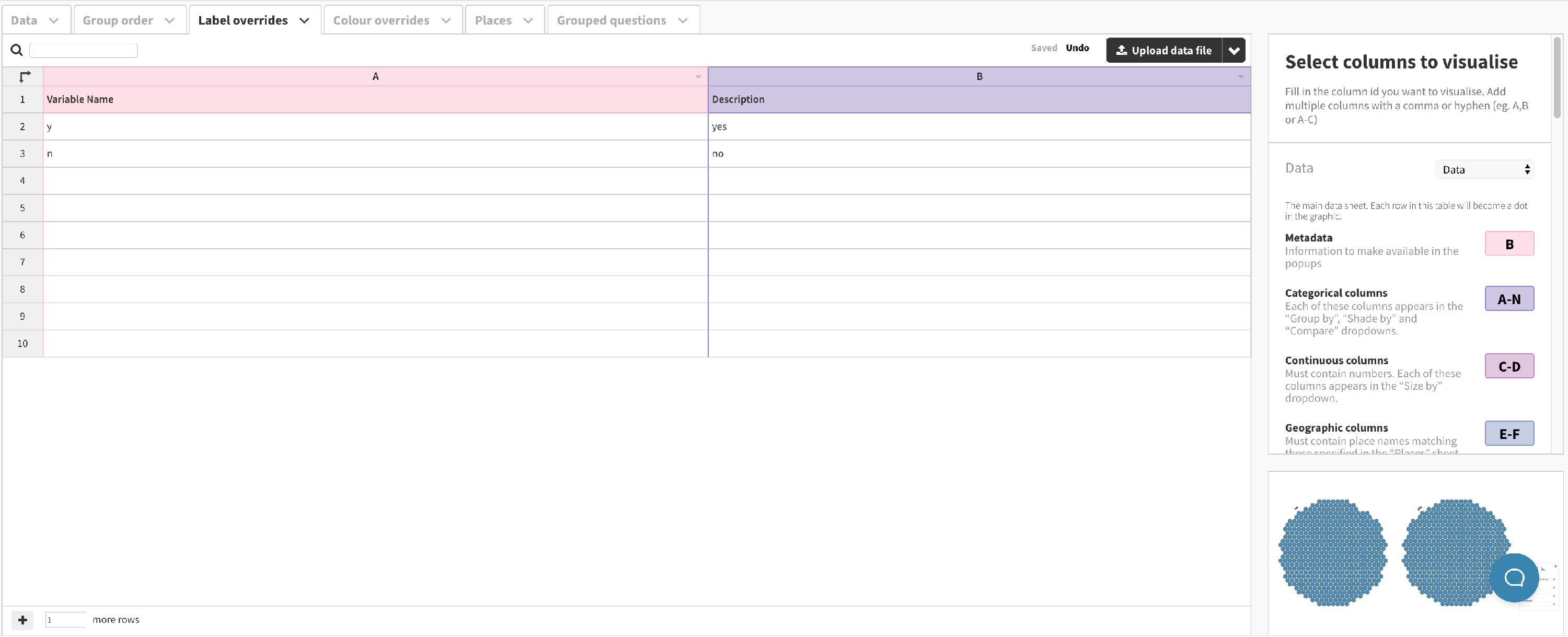
To avoid editing the raw data (which may make it harder to update later), you can use the “Label overrides” sheet.
- 1
- In the "Label overrides" sheet, type the values you want to change (e.g. y) in the first column and the values you want to show (e.g. yes) in the second column. Your "Label overrides" sheet should now look something like this:
-
- 2
- The visualization should automatically update to show the new text. Try grouping the example below by "Hired within the last year" to see the changes!
