Creating a slider or drop-down menu
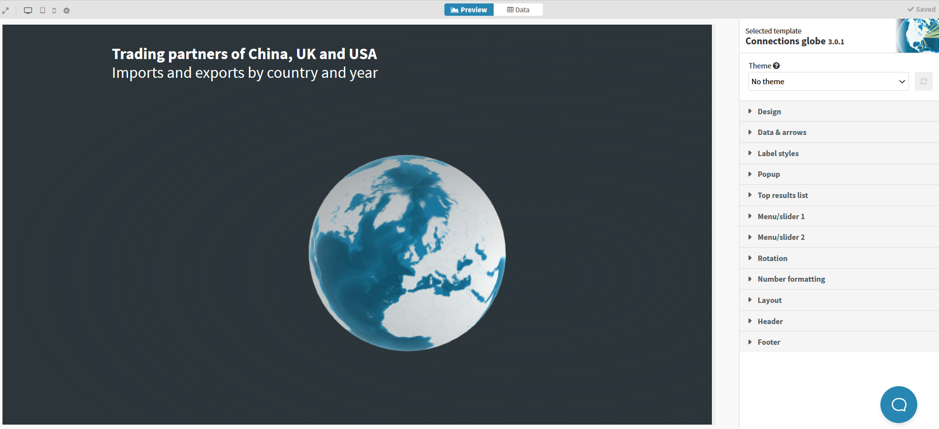
When you visualize connections of any kind, especially if they can span the globe, you might want to differentiate between different values, places or flows.
Right on cue to answer this need, the Connections globe template comes with its own way to easily let the user decide which of their data to display and filter them using menus.
1
Once you have decided on what part of your data to filter your visualization with, head over to your data sheet.
2
On the data binding section, specify the column you want to use for your slider/dropdown menu(s). You can create up to two of those.
TIP: If something does not look right, there’s a high probability this is due to the fact that you need to specify the data type.
3
Next step would be to head over to preview. There, in the Menu/Slider options, you can specify the data type on the data column in order for the slider/dropdown to work correctly and “read” your data correctly.

4
Moreover, you are able to choose between different styles of menus besides dropdown and sliders, such as button groups and buttons.

5
If the labels do not fit in the selection option (for example, in the buttons), you should increase the menu width.


