How to make combo charts in our Line, bar, pie template
If you're looking to visualize a combination of lines and columns, for example to display absolute as bars and a rolling average as a line, you can do this with a combo chart.
To create a combo chart,
1
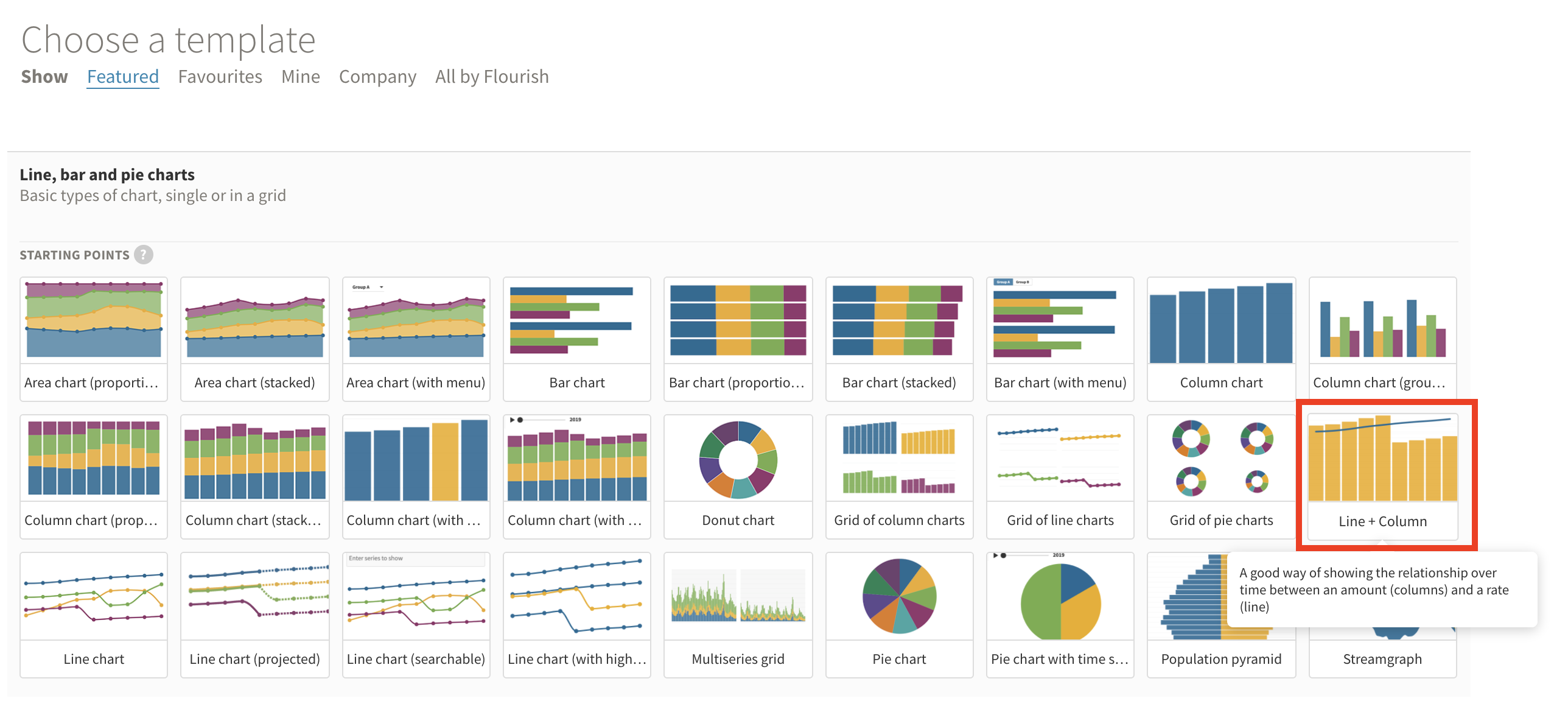
Select the Line + column starting point in the template chooser
2
In the visualization editor, you can choose from a list of other combo chart types from the Chart type dropdown. You will find all the combo chart types towards the bottom of the list.
3
It's time to upload your data! When selecting your columns in the Data tab, note that the series you input first will be drawn as lines, and the rest as columns (or areas, depending on which type of combo chart you are creating).
You can configure how many lines you would like to have in your combo chart in the next step. In our example below, we have supplied our data in the order C, B because we want our moving average to display as a line and our new deaths as columns.
4
To set how many series you would like to display as lines and whether you would like to have a single or a dual axis, head back to the Chart type settings
If you select Single, both your lines and columns (or lines and areas) will display on a single (left) axis
If you select Dual, all of the lines you define under Number of combo lines will display on a separate (right) axis
TIP: Use a single axis for combo charts with the same range and unit of data and a dual axis for data that uses two separate measurement units for the series.
5
When using a dual axis, you can edit your secondary (right) axis range in the Y axis (right) settings. You can also configure the styling of your axis titles and tick labels to appear in the color of the series.
Your secondary axis range will default to the min and max in your data.
TIP: The only time you should use a dual axis chart is to show correlation. In other words: Only use dual-axis charts to show when one data series moves in or out of sync with another data series.
To avoid confusion for your readers, we recommend coloring your axis labels and ticks in the color of the series they refer to. You can do this in the Axis title and Ticks & labels settings.
6
In the video below, you can learn more about the use of dual axis charts: