How to edit the appearance of your labels in the Scatter plot template
The Flourish Scatter plot template allows you to add labels as well as selective labels. This help doc covers the different ways you can edit their appearance.
1
Changing the alignment
To change the alignment of your labels, go to the Alignment settings within the Dot labels settings.
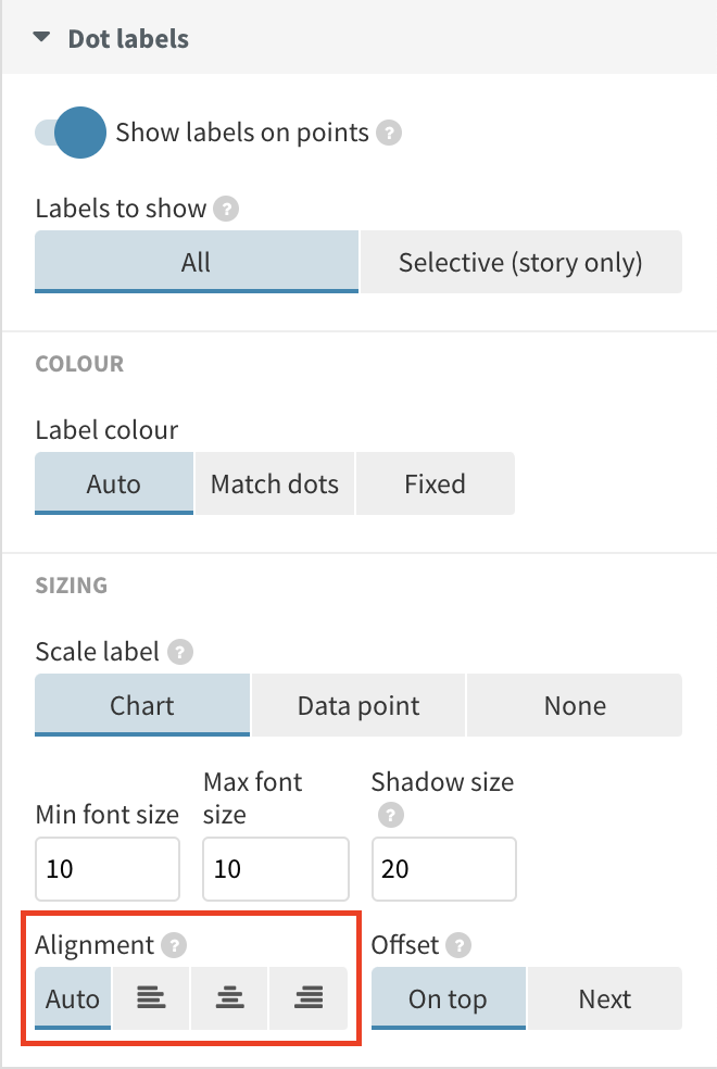
Here, you can select between auto alignment, left alignment, center alignment and right alignment.
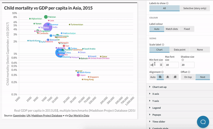
Next to the alignment settings, you can also change the Offset. This controls whether your labels appear on top or next to dots by default.
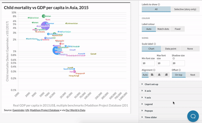
To learn how to display your labels inside your dots, continue to our section on changing the sizing of your labels.
2
Changing the sizing
In addition to the alignment and positioning of your labels, you can also configure the size of your labels in the Dot labels settings.
To change the size of your labels, you can enter a min and max font size as well as a shadow size. Depending on the screen size your visualization is displayed at, it will display something between the minimum and the maximum size you supplied. The shadow is useful to increase legibility in the case of overlaps.
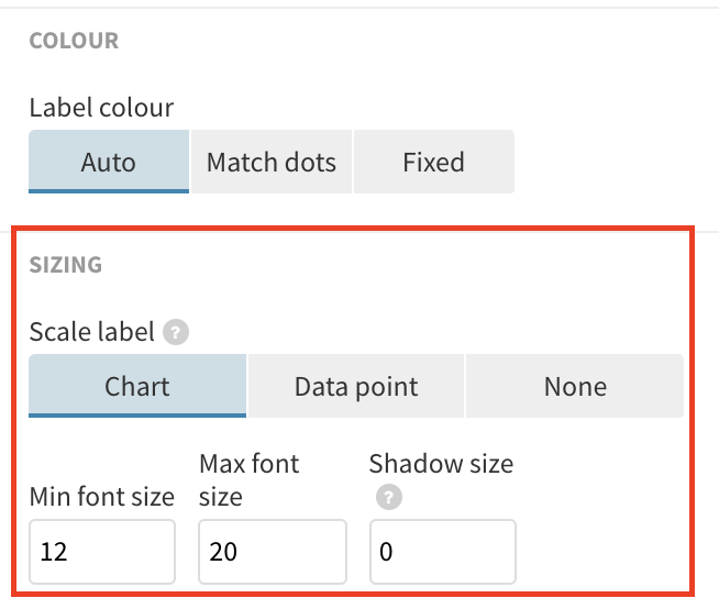
You can also display your labels inside your points by selecting Data point from the Sizing settings. This will attempt to scale labels inside of your points. Labels that are too large to fit inside your dots will be omitted.
If you reduce the shadow size to zero here, the labels will use contrast coloring. This means they will be colored light on dark backgrounds and dark on light backgrounds.
5
Changing the coloring
In addition to the alignment, positioning and sizing of your labels, you can also configure the color of your labels in the Dot labels settings.

- Auto will default to the color of your dots, unless you display your labels inside dots and remove the shadow. In that case, this option will use contrast coloring.
- Match dots will display the labels of your dots in the same color as the dots.
- Fixed will display the labels in a fixed color of your choice.
4
Adding selective labels and annotations
If you have many data points with a lot of label overlaps, you might want to use selective labelling or annotations. You can learn more about this in our help doc.


