How to create a categorical heatmap with labels using our Table template
While we do have a Heatmap template with various starting points, it's currently not possible to display labels on top of your cells. With a little workaround, you can use our Table template to create a categorical heatmap with labels.
To create a categorical heatmap with labels,
1
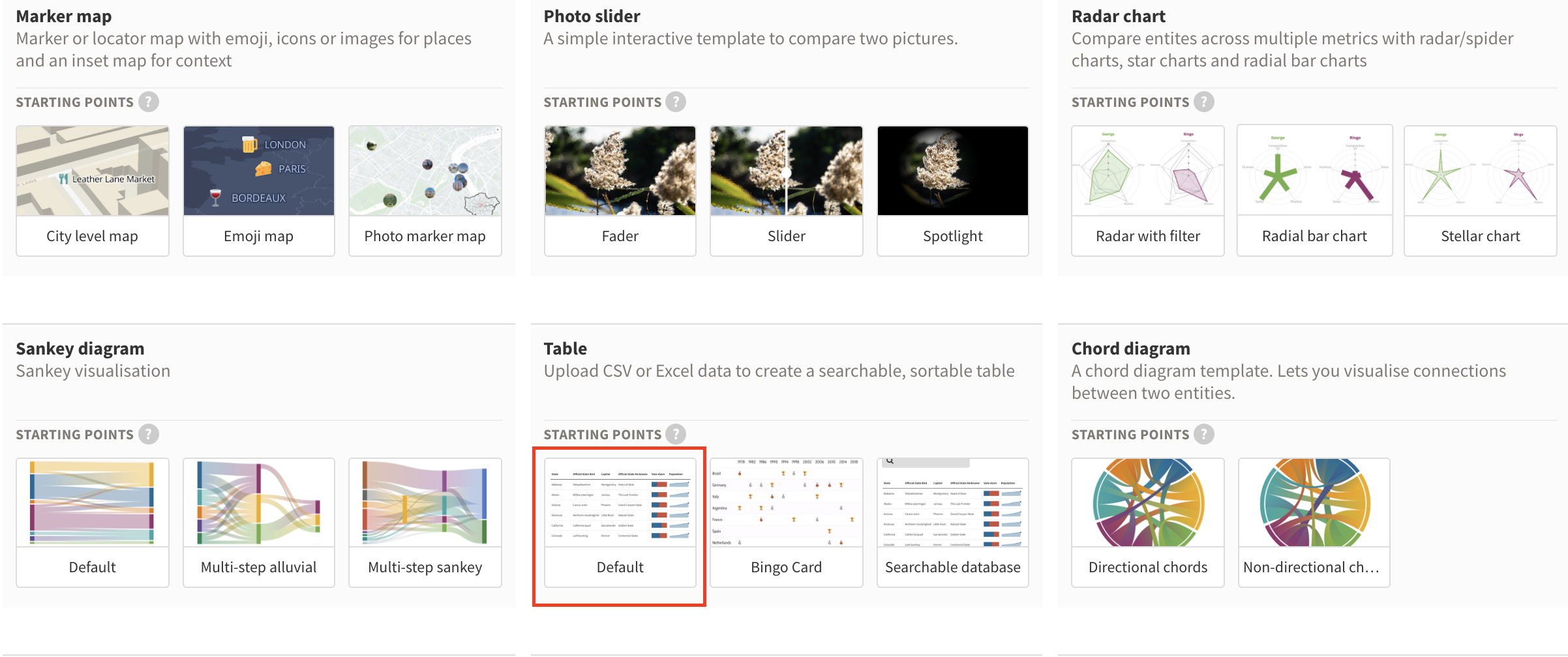
From the template chooser, create a new Table visualization.
2
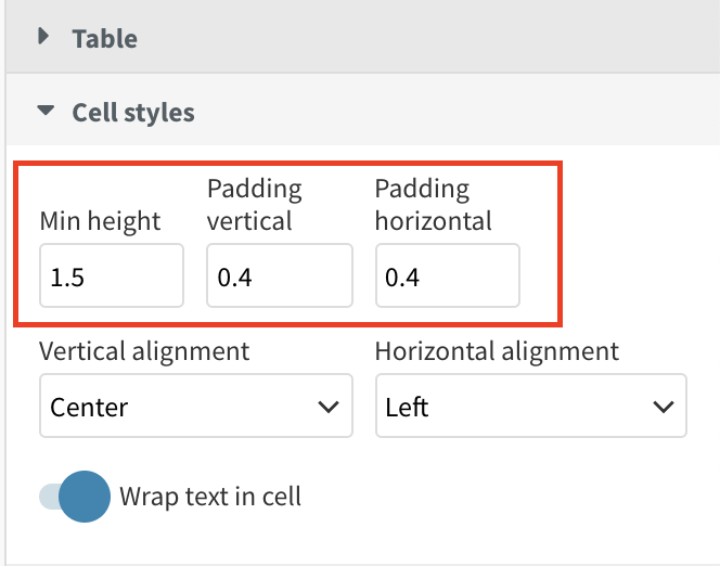
Upload your data and tweak your cell height and alignment in the Cell styles settings.
3
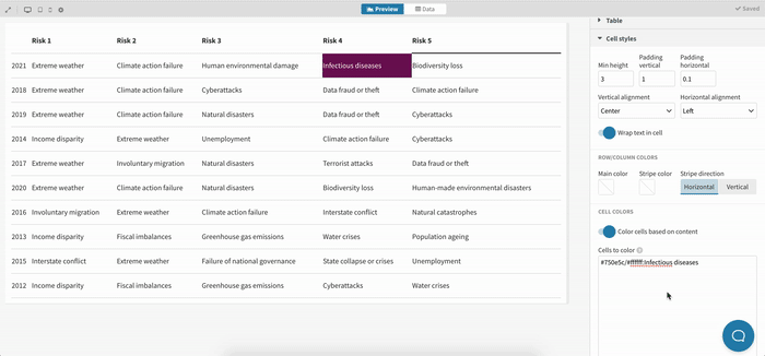
In the Cells to color text area, enter the contents you would like to color in a certain way and with which background and foreground color you would like to color them. You can use the following syntax:
#750e5c/#ffffff:Infectious diseases

4
Repeat the same process for all cells or categories you would like to color differently
TIP: To speed up this process, we recommend using the Ampersand operator in Excel. You can learn more about this here.
5
Tweak the styling of your table by making sure all columns have the same width in the Cell styles > Column width settings and adjust your vertical and horizontal margins.
6
As a final touch, you might want to add a legend. You can create this using custom HTML and placing this code in the Header > Text settings. Here's the syntax you can use to create a legend using HTML:
7
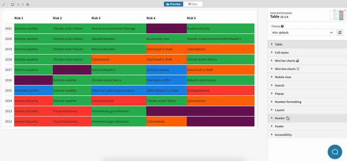
That's it! Here's what our categorical heatmap created with the Table template looks like:
Get started with your own Table visualization now! »


