How to display legend colors in your header text
Instead of adding a traditional legend to your Flourish charts, you can modify header text to indicate which colors correspond to which data points. If you’re aiming for simplicity and a clean interface, this might be the way to go! This help doc will cover how to create these so-called “Riley legends”, named after ex-Flourish data journalist Katherine Riley, in any of our templates.
Check out the video below to find out more, or continue reading this page.
In this article
- 1
-
WARNING: This setting has currently been integrated into the Line, bar, pie and Scatter templates only. However, you can still achieve the same effect as a Riley legend by using custom HTML in the header.
After creating a chart with your colors of choice, you can visit the Legend settings panel, scroll down to the Add data colours to header text setting, and select Auto.

Once you’ve selected this, colors that are used for certain entities in your visualization will be pulled through to your titles.
Here’s an example with our Scatter plot template: the information that would normally be displayed with a legend is now visible in your plot’s header. A further benefit is that in the scatter plot, you can also use the Riley legend as a filter! Try it below.
Get started with your own Scatter plot now! » - 2
- Customize your colored text
-
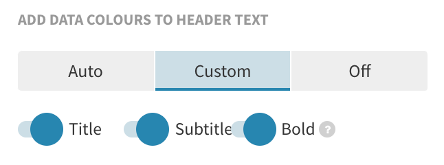
If you would like to customize the way that colored header text appears, click on the Custom tab instead, where you can indicate whether you would like these legend colors to apply only to the title or subtitle. You can also decide whether the colored text is in bold.

- 1
-
In your header, use the
<span style="color:#900304">word</span>HTML tag to color any part of your text. You can use hex codes or type the color you want, for example:<span style="color:maroon">word</span>. - 2
- You can use the same HTML tag to color parts of your subtitle, text and footer, as well.
-

-
TIP: This is a good workaround if there is a mismatch between your data inputs and your header – for instance, in the example above, the legend swatch displays Ban/severe restrictions expected but our header says abortion-hostile states. However, if you use custom HTML in templates that have the Riley legend available, make sure that the Legend > Add data colors to header text option is turned off.
Add colored headers via the Legend settings
Use custom HTML to color words in your header
Even if you are not using the Line, bar, pie or Scatter plot templates, you can still color parts of your header text. Instead of using a built-in setting, you can simply add custom HTML to color any word or phrase.


