Bubble chart – An overview
What is it for?
This chart type has a few different use cases that involve customizing a group of circles in order to compare them. Whether you choose to size bubbles proportionally, position them on an axis, group by color or add images and text, you can create engaging and beautiful visualizations.
How to get started
1
Your data must be in a wide format with one row for each bubble, the only required column being Label.
For example, your data might look like this:
| App |
Downloads (millions) |
Type |
Image |
| TikTok |
656 |
Social network |
Image URL |
| Instagram |
545 |
Social network |
Image URL |
| Facebook |
416 |
Social network |
Image URL |
| WhatsApp |
395 |
Messenger |
Image URL
|
Add extra columns to customize the color, size, axis values and images of your bubbles, and bind any extra information under Info for popups. To learn more about uploading images in Flourish, click here.
2
There are two ways you can use numeric data in a bubble chart: either sizing bubbles by their values or positioning them on an X axis. If you have numeric values, you can choose to use one or both of these bindings.

3
Once you have bound all relevant columns, you can switch to the Preview tab to customize your chart.
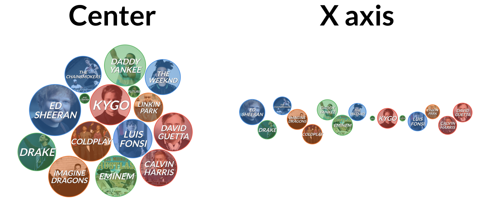
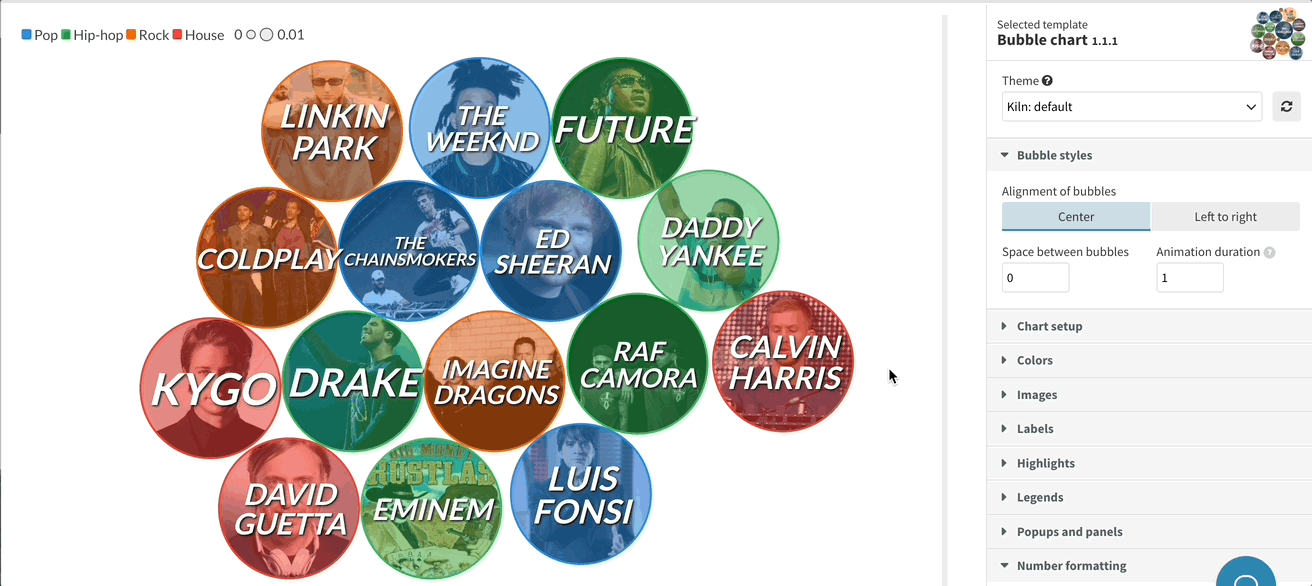
If you have bound a column under Axis values, first set the alignment of your bubbles under Bubble styles. The Center option clusters bubbles together, while the Left to right option positions them on an X axis.
WARNING: Currently, this template doesn’t support date formats. To learn how you can position bubbles based on a date, read this help doc.

4
To ensure that the bubbles are always sized to optimally fit the screen, the template takes into consideration the number of entries, as well as the minimum and maximum value of your dataset. Then, it automatically resizes each bubble. However, you can set a fixed space between each bubble.
5
Under Chart setup, you can specify the visualization's height mode. In Fill space mode, the graphic will fill the whole container, which is the standard Flourish responsive chart size. If you opt for Aspect ratio instead, you can manually set the aspect ratio of the plot, as well as the mobile breakpoint.
 6
Under Labels, style the text labels for your bubbles adjusting text weight, style, case, color and shadow. If you have images, you can also adjust their border and opacity under the Images settings.
6
Under Labels, style the text labels for your bubbles adjusting text weight, style, case, color and shadow. If you have images, you can also adjust their border and opacity under the Images settings.


6
Depending on your data, you might have up to three different legends for color, size and position. Under the Legend settings, customize options like orientation, alignment, ordering and add custom legend titles.
Here's a few ways you might want to display your legends:

Get started with your own Bubble chart now! »


