How to create textured bar, column and area charts
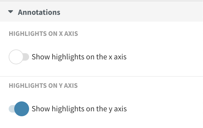
There's a nifty workaround to make textured bar, column and area charts possible using axis highlights.
For bar and column charts it's easy to select which elements to have textures, but with area charts this feature works better when you have just the one series.
To create a textured chart,
::Series 1>>Series 3
- Make sure the Area color matches your background color. In our case, this is white.
- By changing the Area opacity, you can control the intensity of your texture. A higher opacity makes for a more noticeable, a lower opacity for a more subtle texture.
- You can choose between three Area textures: diagonal lines, gridlines and dots.

Create your own now! »