Data explorer – an overview
One of our most effective and powerful templates is the Data explorer. This template aggregates data and shows insights in an interactive and visually appealing way.
What is it for?
This template is specifically designed for exploring and presenting data. Each row of data is represented by a single shape (e.g. a circle) and you can choose different columns to position, size and color the shapes by. There are several different layouts including packed circles, beeswarm, scatter and even a map view.
How to get started
- 1
- Choose a Data explorer starting point from the template chooser.
- 2
-
Next, upload your data to the template. Similarly to the Survey template, the Data explorer needs one row per entity, with all relevant information in separate columns.
Country ID Continent Result Value-19 Value-20 UK GBR Europe Pass 1.4 1.8 US USA North America Fail 3.8 3.7 Australia AUS Australia Fail 5 5.2 - 3
-
The Data tab consists of three different spreadsheets – Data, Geo Regions and Geo Points. The main Data tab has multiple column bindings that determine the information type and what users can select in the dropdown menu of the visualization.
The two main types you can divide your columns into are Categorical and Numerical. The category columns determine the Color and Aggregation options in your chart, and you can also select a column to Filter by. Meanwhile, the Numeric columns are important for the positioning of each entity on an axis and the sizing of the shapes.
-
- 4
- Last but not least, the Geo regions key and Geo point key are crucial columns when you have geographic data. They serve as unique IDs for joining boundary data in the Geo Regions datasheet. This column must contain values that exactly match the Geo region key values in the second data tab. The same goes for the Geo point key and Geo Points spreadsheet.
-
- 5
-
Similarly to our Projection map template, the Data explorer’s geographic data can be split into Regions and Points.
The information in the Geo Regions tab is used to create a map view of your visualization. By default, there are Alpha-3 country codes imported as unique IDs, so if you don’t have your own GeoJSON file to upload, you can use this column as an identifier in both the Data and Geo Regions tabs.
The Geo Points tab works in the same way as the Geo Regions sheet, with the exception that the coordinates used are Latitude and Longitude and not individual shapefiles. However, you will still need a unique ID column that exists in both this spreadsheet and initial Data tab.
Tip: You can download GeoJSON files directly from Flourish! If you don’t have country codes in your spreadsheet but only country names, you can download the world shapefiles from our World’s Projection Map blueprint and use the Upload & Merge function in the Geo Regions/Points tabs to add more identifiable information.
- 6
- Depending on your column bindings, your Data explorer will have multiple filters which users can explore. Alternatively, you can create a story to build the desired narrative. In general, these settings help the user explore the information and easily spot trends and patterns. You can customize the look of these controls under the Controls settings in the Preview tab.
-

- 7
- The Data explorer settings allow you to adjust the Maximum radius of the Scatter plot layout, as well as set a different Aspect ratio. In addition, you can choose to hide values with invalid or missing data – for example, if your axis is positioned according to a categorical column, items without a valid value will be filtered out.
-

- Under Color, you can adjust the look of both your Categorical and Numerical coloring by switching between the Scale type. You can also choose a different Default color of your entries, as this would be the default view of your chart unless you create a story.
- While the Item labels are the default labels of your entries, the Group labels settings are used when you position your data by a single category. In addition, you can Sort the groups in ascending or descending order, or in the same order as your data sheet by selecting None.
-
- 8
-
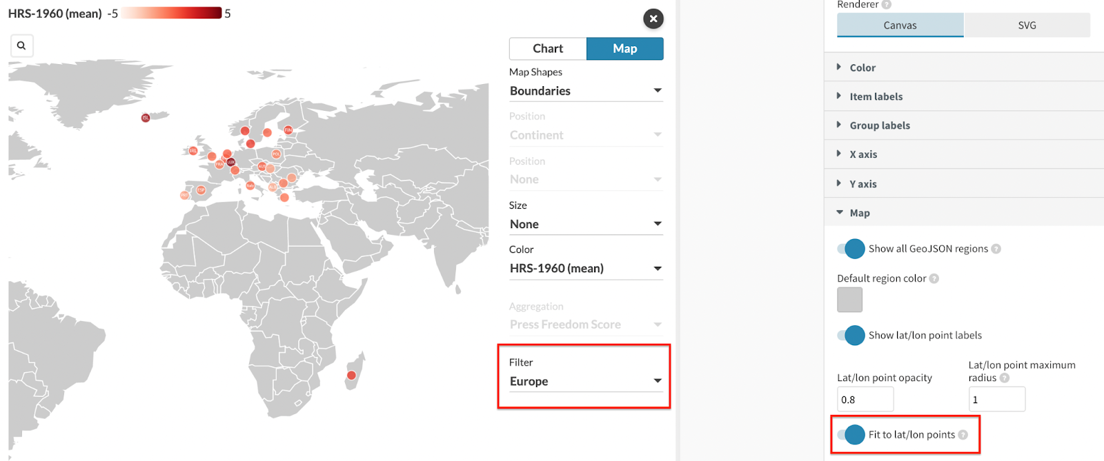
Last but not least, you can customize your Map view under the Map settings. You can decide whether you would like to include countries with no data in your layout or not, by using the Show all GeoJSON regions toggle.
If you have a Points layer included, you will be able to adjust the points’ opacity and display/hide their labels. In addition, if you use a Filter alongside your points and prefer a zoomed-in view of one particular area, you can enable the Fit to lat/lon points toggle.
-