Timeline – an overview
What can this template do?
The Timeline template can help you visualize time series data from the past, present, and future. With the ability to categorize events by color, customize markers and add images, you can create an engaging timeline for your users to delve into.
How to get started
- 1
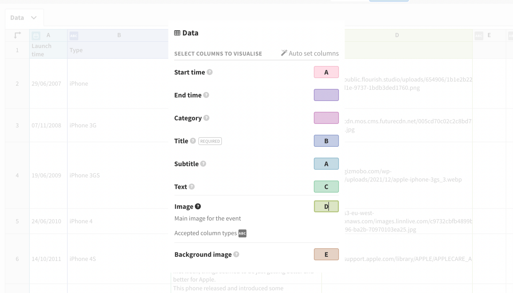
- For the Timeline template, you’ll need long format data, where each row represents a single data point and each column represents a variable. We recommend that your data has the following layout:
-
Start time (Required) End time Category Title Text Image 11 October 1968 22 October 1968 Saturn IB Apollo 7 Crewed by Wally Schirra, Donn F. Eisele and Walter Cunningham, the Apollo 7 mission included first live TV broadcast from American spacecraft. https://public.flourish.studio/uploads/ccc2f492-d02f-4a7d-b262-40974c8277a3.png -
TIP: If your data isn’t already in a long format, you can transform it using the unpivoting function.
WARNING: At the moment, the Start/End time columns only support written months in English. If you use date formats like 21 février 1967 or 21 febbraio 1967, your data will be recognized as text and the visualization won't work.
- 2
- Once you have uploaded your data, bind the columns to the relevant bindings into the Data tab. If you need further information about what each column binding does, click the question mark button next to the data binding for more information.
-
- 3
- Head over to the Preview tab to start editing your visualization.
Editing your timeline
There are a few different styling options to customize your timeline.
- 1
- Choose the Orientation of your visualization under Timeline. Here, you can also choose the Height mode of the visualization. For vertical orientation, the Auto mode will take into consideration the number of events and will remove the navigation controls, so the user can freely scroll through the timeline.
-

- 2
- Decide whether your timeline scale is Equally spaced or is based on the Time scale within your datasheet.
-


- Equally spaced is a good option if there are some very long gaps between events as well as very short ones.
- Time scale will plot events in proportion to the actual time between them.
TIP: You can change the way your date/time is displayed in the template directly from the Data tab – click here to learn more.
- 3
- Change the appearance of the Event marker, Event content and Event image.
-

- Event marker: This is the circle signifying the event on the main timeline, along with the connecting lines between the circle and the information about the event on the timeline.
- Event content: This is the information that displays the events that appear on either the side/top and bottom (depending on the orientation you choose) of the timeline. You can change background colors, alignment and styling of your title, subtitle and text and more.
- Event image: If you have included images within your datasheet, within these settings you will be able to choose whether your image is in the marker or included within the content. Additionally, there are settings to specify how you want your image to appear depending on which option you choose.
-
TIP: You can upload images directly into the datasheet. To find out more, click here.
- 4
- If you have bound a column under Background image in the Data tab, you'll notice additional set of settings in the Preview window. You can adjust the opacity and sizing of your background images, which will change as you scroll through your timeline.
-
WARNING: Please note that for vertical timelines, the background image will only appear if you have selected a Standard height mode.
-

- 5
- Change the styling of the Navigation, which is how your users will interact with your visualization.
-

- The Step by settings is useful to adjust the way your timeline loads events. By choosing Window size, the visualization will take into consideration the screen's aspect ratio and the Proportion number you have selected as default. Alternatively, you can transition between individual events by choosing the Events mode instead.
-
In addition, you can adjust the styling of the buttons that control the navigation, by changing the icons to be Default or Custom, where you can upload your own images, alongside adjusting sizing and opacity. You can also add a Gradient which will appear at the top/bottom or both sides depending on the orientation you choose.
-


Now you know the basics, click on the button below to get started.