How to add axis titles
While not always necessary, axis titles can add important context to your visualization. Learn how to add them below!
1
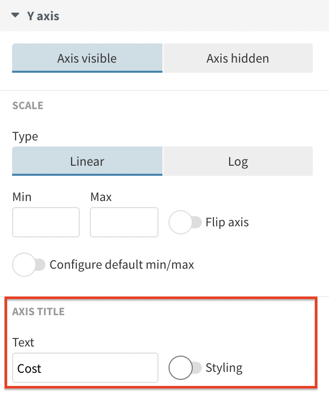
Under each axis-specific settings in the Preview tab, you will find an option to add an axis title.
2
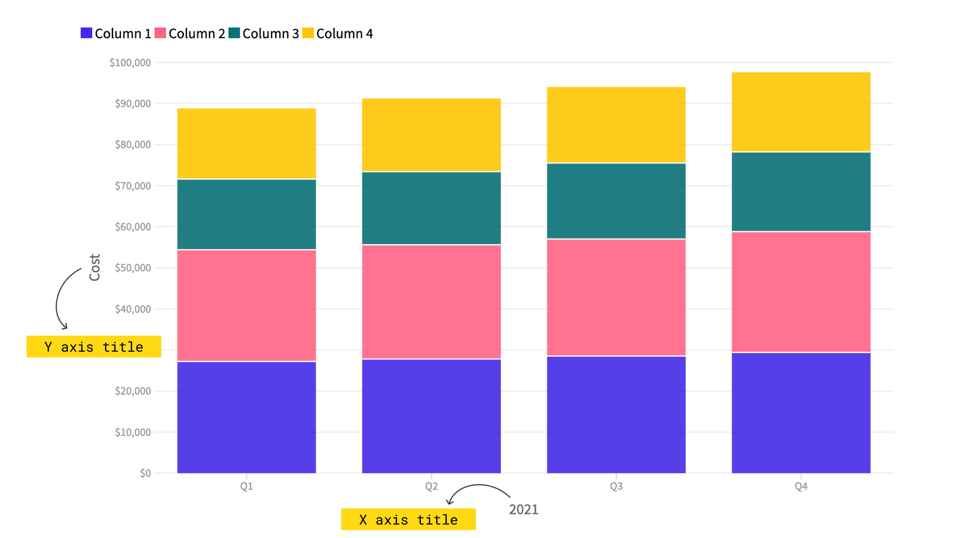
If you need to add a title to your X axis, head over to the X axis settings in the Preview tab. Respectively, you can do the same with your Y axis and even with your Y axis (right), if you are creating a Combo chart.
3
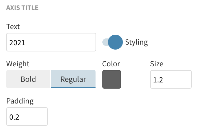
After adding your title text, enable the Styling toggle to customize the look of your titles, including weight, color, size and padding.
4
In some templates such as the Scatter, the axis titles are enabled by default, using the name of the columns bound under X and Y values in the Data tab.
5
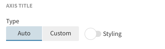
If you prefer the title removed, you can select the Custom option and leave the text box blank.

TIP: If your axis labels are displaying straightforward and easily understood information (such as years or months), consider not having an axis title. Only add titles to axes that may need further clarification. For more best data practice tips, read our blog post.


