How to create a bar chart with the Table template
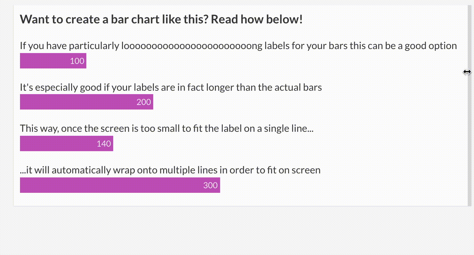
The Table's mini bar charts offer great flexibility in terms of their labels – they can wrap on a second row on smaller screen sizes, and you can customize each individual label by using custom HTML & CSS in the Data tab.
1
Create a Table visualization using the default starting point.
2
In the Data tab, paste your bar labels into one column and the respective values in another. However, leave the name of your category column blank.
| Leave blank |
Values |
| Category 1 |
100 |
| Category 2 |
200 |
| Category 3 |
140 |
3
In the Preview tab, head over to the Mini bar chart settings and paste the name of your numerical column. This will display the values as bars.

4
Leave the New column name text box blank.

5
Under Mobile view, select the Blocks option and set the Mobile breakpoint width to a higher value, for example, 1400. This will ensure that your visualization will be displayed as a bar chart on both desktop and mobile.

TIP: If you have more than three categories (bars), increase the Rows per page value to the number of your series.
6
Any text labels that are longer than the longest bar will now wrap onto multiple lines. You can adjust the width of the bars under Mini bar charts >> Width.

7
You can now start customizing the look of your bars. If you would like no border between the different bars, head over to Cell styles >> Border and choose a border thickness of 0.

8
Under the Mini bar chart settings, you can choose whether you would like labels on bars, as well as adjust the width and color of your bars.

9
If you would like to increase the height of your bars or reduce the spacing between them, you can do this under Cell styles.


