How to create a line chart with projections
Need to add an estimated forecast to your line chart? Find out how to do this below.
1
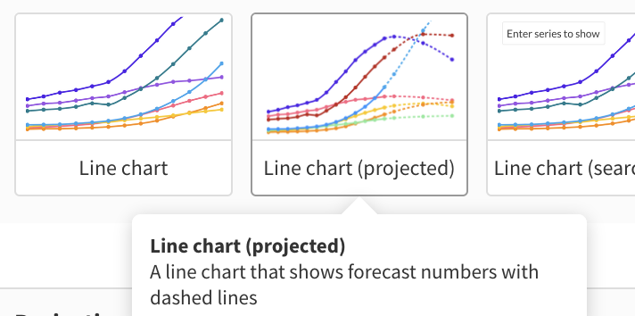
Start a new visualization by choosing the Line chart (projected) starting point.
2
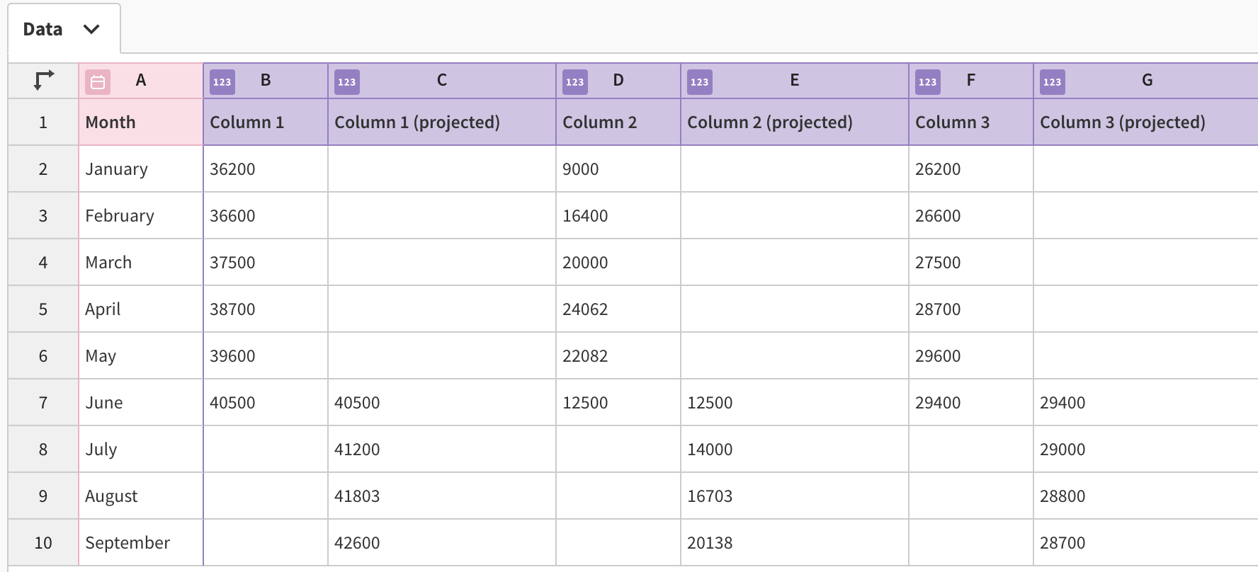
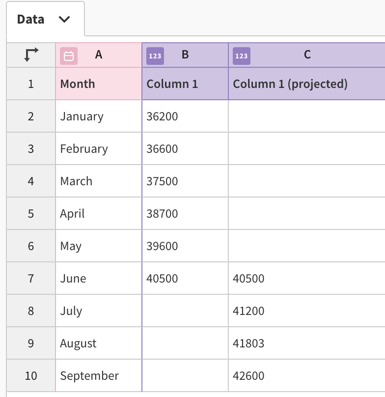
By going to the Data tab, you can see how the data is structured. You need two columns for each category – one for certain values, and another one for projections.
3
To ensure there are no gaps between the two lines, copy the last certain value and paste it as the first value of the projection line.
4
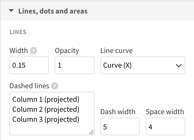
If you have renamed the column headings or uploaded your own data, you will have to change a few custom settings in the Preview tab.
Firstly, head over to Lines, dots and areas and paste your projections' column names in the Dashed lines setting. You can also adjust the look of your dashed lines from here.
5
To change the colors of your lines, you can use the Custom override setting under Colors.
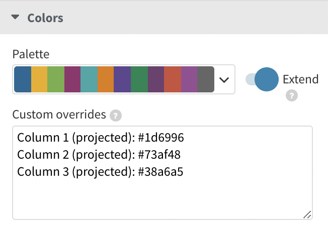
6
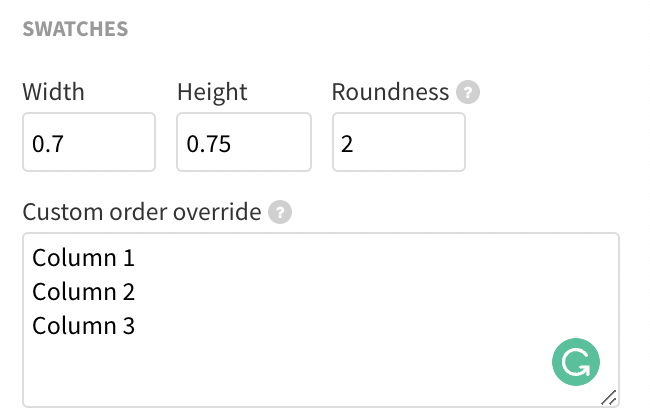
Last but not least, if you prefer to have the projections' legend swatches turned off, use the Legend > Swatches > Custom order override setting and only add the swatches you want to be displayed. In the example above, notice how only three swatches are being shown (as opposed to six).
Get started with your own line chart now! »


