What are the different Flourish legends?
In Flourish, you can benefit from using various legends in different situations. Learn more about each legend type below!
Default legends: Categorical
The categorical legend represents categorical data, such as names and regions. In most Flourish templates, it will appear by default above your graph once you input your data. As a bonus, the legend can be used as a filter if you leave it interactive. However, to turn it off or customize it:
1
In the Preview tab, scroll down to Legend. Under Legend mode, you can choose whether to switch it off or leave it on. The Auto mode hides the legend in certain situations, such as when each color is already explained in a Grid of charts.

2
Under Click legend to filter data, you can adjust the behavior of the legend. Single select allows users to click on one of the legend swatches and focus on this specific category. On the other hand, the Multi select option filters out all legend swatches that have been clicked, thus allowing the user to compare multiple categories.
 However, these options will only apply when the Series filter has been turned off.
NOTE: Please note that categorical legends are not always interactive. Only the Line, bar, pie, Scatter, Bar chart race, Cards, Radar and Network graph support filterable legends.
3
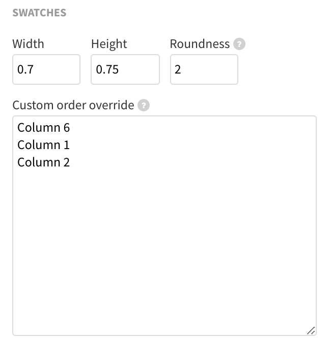
Under Legend >> Swatches, you can manually specify the order of your legend entries. This is useful when you would prefer your legend to be in alphabetical order, for example. However, as with all other custom override settings, the input in the text box should exactly match your column names. Read more about this here.
Default legends: Numeric
The numeric legend takes into account your plots’ minimum and maximum values and applies color accordingly. In that way, you can visibly depict information about each graph point.
Numeric legends work great in our Maps, Scatter or, for instance, in the Survey template. By default, the legend will automatically apply if you select a column containing numeric data under Color (in some cases, under Value).
1
Numeric legends use two types of coloring – Sequential or Diverging. If you choose a Diverging palette, you can also customize your Minimum, Midpoint and Maximum colors.

2
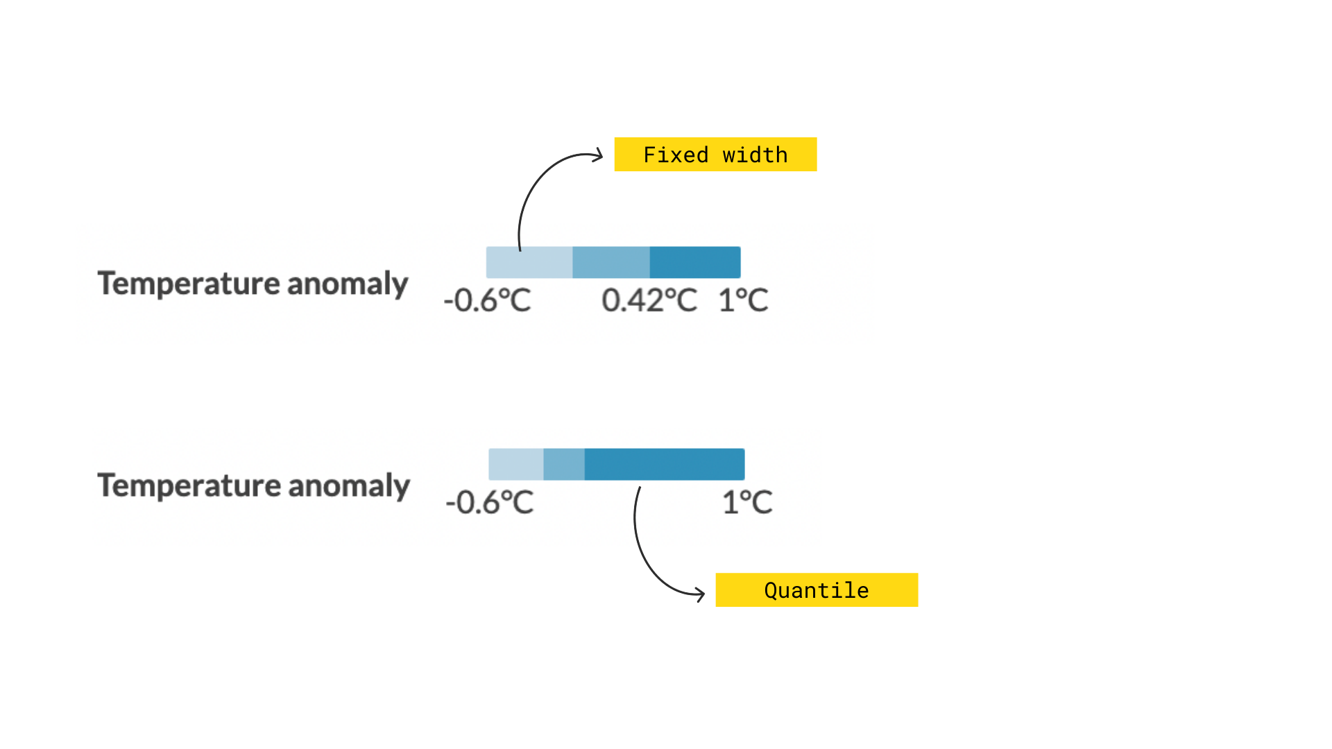
In addition, you can choose whether your legend should be continuous ( Linear) or Binned. If you opt for the Binned option, you can customize the Binning mode. While the Fixed width will take into account the number of bins and split your values at an equal distance, the Quantile mode will take into account your data and aims to assign the same number of observations to each bin.
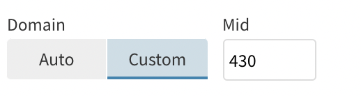
In addition, you can choose a custom Domain for the division of your bins, by manually selecting your Mid value. Read all about custom colors and thresholds here.
Although the Numeric legend settings can be found in various places across the different templates, these essential options are available everywhere.
Riley legends
Combining legends with titles makes your visualizations simpler and more impactful – and it’s super easy in Flourish. The Line, bar, pie and Scatter templates have an integrated setting that allows you to create the so-called “Riley legend” in a matter of seconds.
WARNING: This setting has currently been integrated into the Line, bar, pie and Scatter templates only. However, you can still achieve the same effect as a Riley legend by using custom HTML in the header.
1
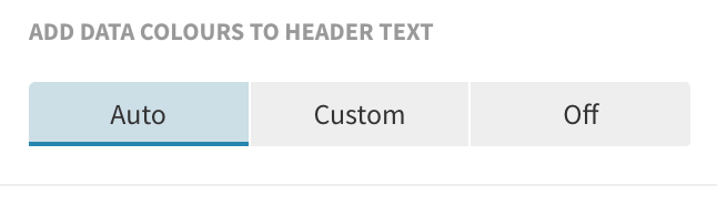
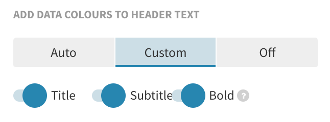
Under Legend in the Preview tab settings, go to Add data colors to header text and select Auto. Once you’ve selected this, colors that are used for certain entities in your visualization will be pulled through to your titles.
 2
Customize your colored text
2
Customize your colored text
If you would like to customize the way that colored header text appears, click on the Custom tab instead, where you can indicate whether you would like these legend colors to apply only to the title or subtitle. You can also decide whether the colored text is in bold.
3
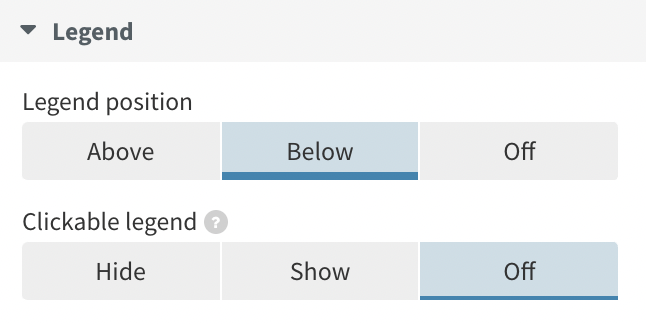
In the Scatter template, you have an additional bonus function of the Riley legend – it can also be used as a filter! The clickable properties of your default legend will automatically apply to the colored text in the header, too. Therefore, if you would like to change the way the legend interacts, you should do this from Legend >> Clickable legend. Once you adjust the interaction, you can turn the legend off.
Labels on lines
In certain occasions, having Labels on lines is actually more beneficial than having the traditional legend on top. This is due to the fact that the eye movement between the "legend" and the chart itself is minimized. See the story below to compare!
In the Area, Stream and Line charts, you can do this in a few simple steps:
1
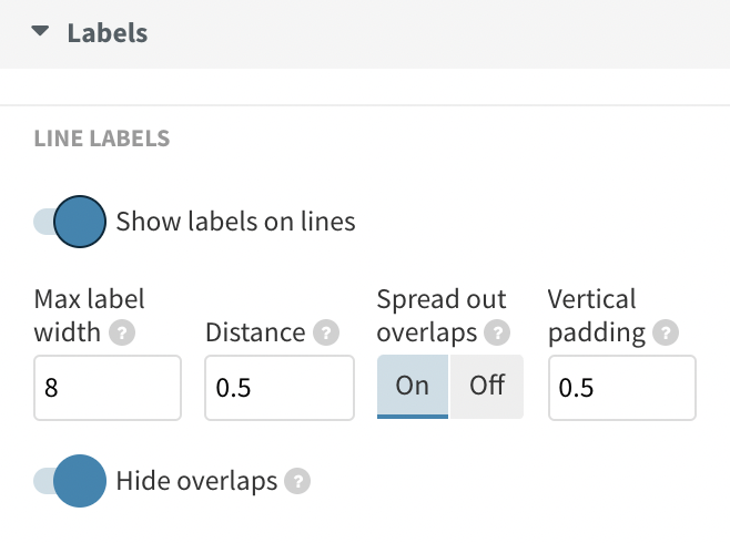
Under Labels, turn on the Show labels on lines toggle.
2
You can customize your line labels by adjusting the Max label width, distance and padding. You also have the option to hide overlaps.
3
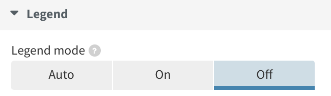
As those labels contribute to the visualization in the same way as the legend, you can turn the legend off.

 However, these options will only apply when the Series filter has been turned off.


