How to add a time slider to your Line, bar, pie charts
A time slider is a great option to showcase a change over time in your dataset. In this help doc, you'll find a step-by-step guide on creating animated Line, bar, pie visualizations that use this filter mode.
1
Create a new Line, bar, pie visualization using one of our starting points.
TIP: It is important to make sure that you are using the correct chart for your dataset. Sometimes, a different Flourish template may be a better choice than Line, bar, pie.
For example, if you want to gradually show how values change over time, then a Line chart race may be a better option.
Alternatively, if you are only willing to visualize one line over time (as opposed to comparing multiple series), then this help doc can provide better guidance.
2
In the Data tab, upload your data and select the appropriate column bindings for the Labels/time (axis) and Values.
 3
Take a look at your data – are you using a long or wide data format?
If you are using a long data format, then you may have to bind an additional column under Row filter, in order to enable the time slider.
3
Take a look at your data – are you using a long or wide data format?
If you are using a long data format, then you may have to bind an additional column under Row filter, in order to enable the time slider.
 4
Under Controls & filters in the Preview tab, you may have to adjust different settings, depending on whether you have selected a Row filter binding or not. You have two options – the Series/column filter or the Row filter (if you have the relevant column binding enabled).
4
Under Controls & filters in the Preview tab, you may have to adjust different settings, depending on whether you have selected a Row filter binding or not. You have two options – the Series/column filter or the Row filter (if you have the relevant column binding enabled).

5
If you don't have a row filter enabled, head to the Series/column filter and choose Single select. If you do have this column binding, follow the steps below, but make sure you are customizing the Row filter options 👆.

6
Under Controls > Control type, select the Time slider option.

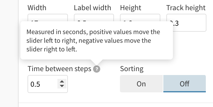
7
By enabling the Advanced settings toggle, you can further customize the behavior of your time slider. Reduce or increase the time between steps by providing the duration in seconds. Moreover, you can turn the Sorting option off, in case your dates are not displaying in the right order.
8
You may notice a fading animation between each step. To fix this, head to the Animation settings and turn off the following two toggles:

9
That's it! You now have a fully interactive Line, bar, pie visualization with a time slider.


